Are you wondering what the top brands and companies are doing on their websites to make a statement? Perhaps you’re looking for new web design trends that will make your next project stand out. Or, maybe you’ve been using the same general design styles a bit too much lately and you need some fresh inspiration to help you break out of your slump and get the creative juices going.
As web designers, our creativity comes from seeing what’s out there, what’s being used and what’s hot.
Thankfully, you don’t have to venture too far into the internet to find the top web design trends of 2019.
Related: 14 tips for successful web design projects
11 top web design trends
Check out this curated list of current web design trends that can help you make the most of your next web design project:
Breaking out of the same-old UI grid system.
- Sketches and abstract illustrations.
- Large text as the center of attention.
- Establishing trust with customer stories.
- Left/right content blocks.
- The ever-growing footer.
- Going old school with vintage and serif fonts.
- Offering two simple options.
- Using white space to focus attention.
- Scroll animations.
- Full-screen video backgrounds.
You’ll love these examples we’ve collected of real-world trends that are in use by large popular brands and companies, not just creative design agencies.
1. Breaking out of the same-old UI grid system
Web designers have been tied to the UI grid system that imposes strict and rigid limits on creativity. However, as web designers look for innovative ways to make web design more interesting, the rules are being bent and the UI grid is being broken to create captivating web designs.
This style works great for design blogs, fashion brands and even personal portfolios. Though it might not be the best approach for corporate brands that want to keep a stricter and more traditional format.
As web designers, we have been so stuck to this rigid grid system, I’m personally looking forward to more designers and brands breaking away from the status quo of web design.
This trend pushes a boundary that allows graphic designers to think outside the box and be more creative.
2. Sketches and abstract illustration
More and more brands are starting to use illustrations on their websites — possibly because it makes brands look more personal and less corporate. Some designs, like online bank Ally, blend more abstract illustration into real photography.
Grammarly does a great job using abstract illustration as a way to fill in white space in a manner that’s aesthetically pleasing and doesn’t take away from the main message on the page.
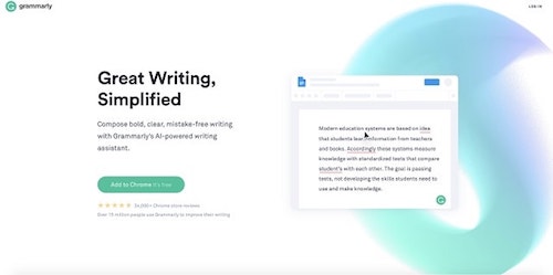
This web design trend is a great way to mix a more artistic element into the design of any website, making the online experience more pleasurable and not just a page full of text and images. We can expect this trend to continue for several years to come.
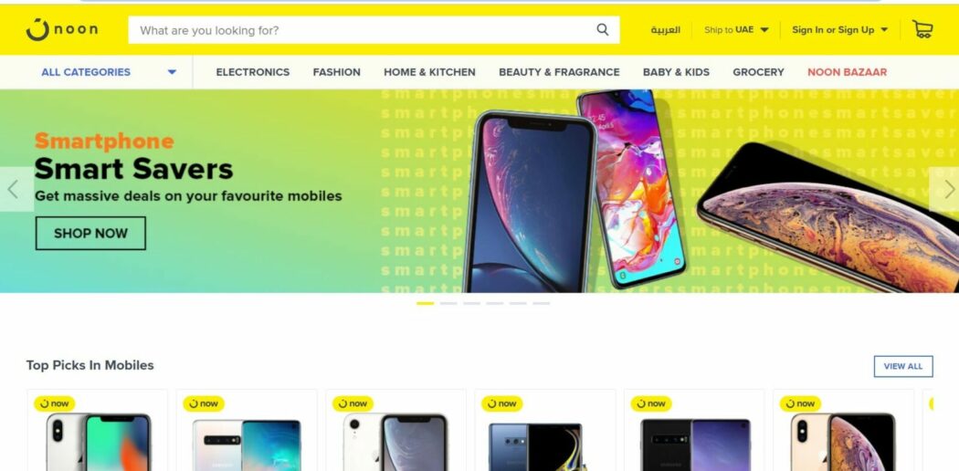
3. Large text as the center of attention
In the past few years, web designers have fallen in love with the trend of large hero images, animations and background videos that make a statement the second the page loads.
Now, some web designers are getting right to the point with the use of overly large text that becomes the center of attention.
Text is overlaid on images with bold fonts, and bright colors are often used to grab attention.
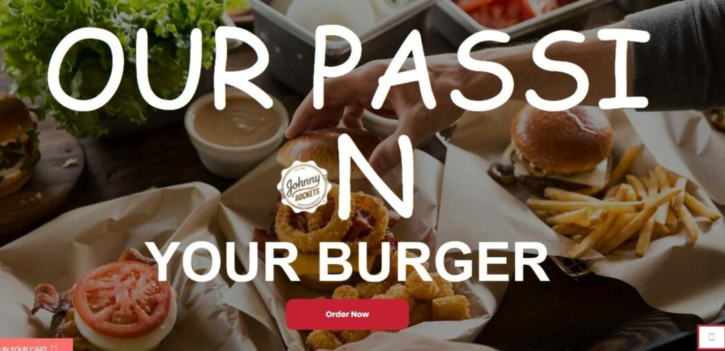
Take a look at the Johnny Rockets UAE website, for example. It uses large text in the center of the page to tell you exactly what they want you to know. In fact, in this example, the text captures so much of your attention that you almost don’t even notice there’s a burger in sight.
This web design trend is becoming more popular for restaurant chain websites as well as design agencies and consultants who want to keep their design portfolios minimal while still getting the point across.
4. Establishing trust with customer stories
Personally, as a marketer, this is one of my favorite web design trends of 2019. It’s a genius way to establish credibility from the start and have someone else do the talking for you.
What better way to sell your online services than having your own customers front and center?
Having a real-life use case of how a product or service solved a real-world problem is more powerful than a long list of features will ever be.
However, as a marketer, I also know how curated these front-and-center testimonials can be.
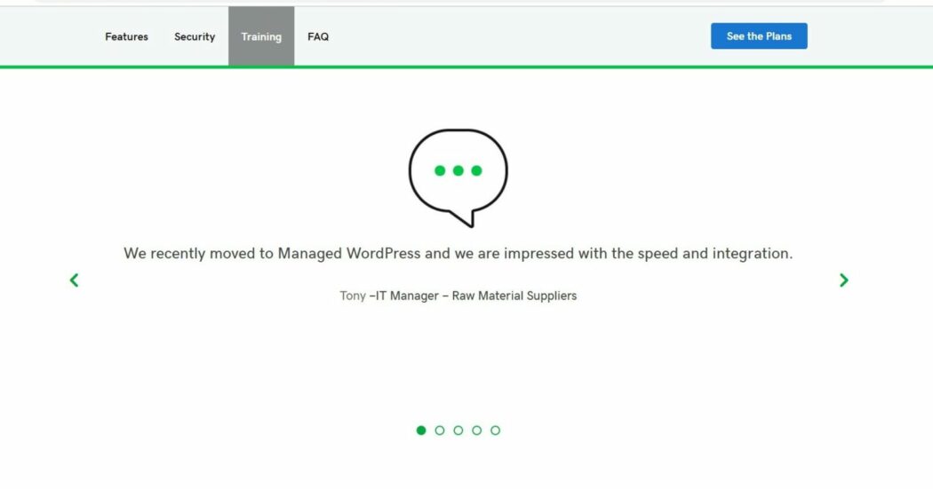
This trend can be expected to grow, especially with reputable brands that want a way to highlight their customers and show how their product works, as opposed to telling how it works.
5. Left/right content blocks
The internet just can’t seem to get enough of these left/right blocks!
It’s exactly what you’d think it is: content placed in the alternating left and right positions. I have seen this style used so much, even in my own professional projects.
Recently, I asked our creative agency to re-create a web design mock for a client because the left/right blocks were used yet again, and I was told politely they would not be changing this style because “it simply works.” As much as I wanted to see something new, I do have to agree that it’s simple, it looks good, and it works.
Some notable sites that use this left/right content block style on their websites are Gifox and GoDaddy.
This style is actually very appealing to the eye, allowing content to flow nicely, even when there’s a lot of it. This simple repositioning of content keeps the visitor engaged to keep scrolling.
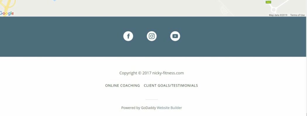
6. The ever-growing footer
Footers used to be overlooked and boring; a place where copyright text was placed along with a group of social media icons. Not much thought was put into them. But lately, web designers have been paying more and more attention to the footer.
This piece of real estate exists on basically every website on the internet, and web designers are finding that the footer serves as a spot to add some “before you go” thoughts.
Not to mention, footers used to take up about an eighth (at most) of the screen size. Today, they are taking up about a half, if not more, which drives the visitor’s attention to the footer content.
Nicky Fitness uses the footer as a place for his social links, and to redirect visitors to his online coaching page and the client's testimonials page too.
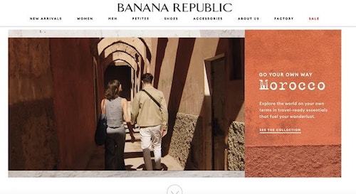
7. Going old school with vintage and serif fonts
Old school is cool again, as the usage of vintage and serif fonts makes its way into these 2019 web design trends.
Over the past few years, brands across the board have started to make their logos more streamlined by using sans-serif fonts, which are softer, rounder fonts that make logos and taglines easier to read. It now seems like every brand and website is using these sans-serif fonts, and this is where the old-school, serif fonts are starting to make a comeback.
These vintage fonts truly stand out from the sans-serif-dominated web as they make a statement and help brands appear bolder and trendier.
These fonts are sometimes used on websites that have a regular content rotation on the home page, like Banana Republic.
8. Offering two simple options
Web designers want to make it as easy as possible for visitors to understand what to do, and facilitate an action to be taken upfront without much thought.
Take a look at Brandripplr website, for example. This popular influencer marketing platform that partners with micro-influencers and connect them with brands, the website's homepage has two choices: to sign us as an influencer or as a brand.
The design uses simple call-to-action buttons and uses subtle pastels in the background.
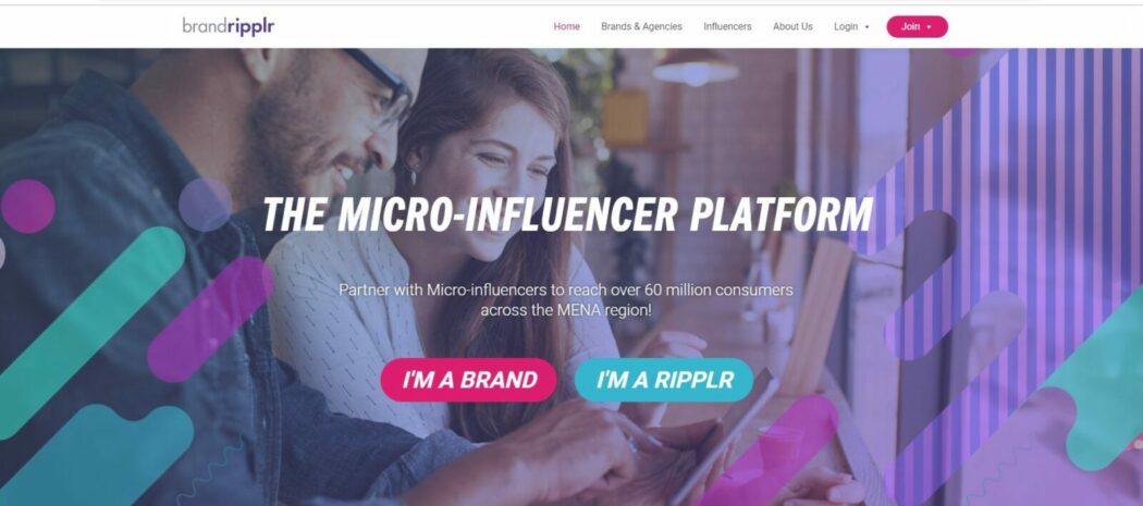
This web design trend works very well when your website needs to “guide” your visitor into making the right choice from the beginning, or when there’s a possibility of them getting confused about which product of yours they should use. Or, if you have multiple options for your customers to interact with your business, like Brandripplr, then this two-option web design trend is recommended.
Where I believe this trend falls short is that it’s too simple, and it really banks on the assumption that your visitors will already have a general idea about what your product or service does and why it’s better than the rest.
This design style assumes that the user has done their research and now they just need to be guided to the correct action.
This web design doesn’t give too many details on your product or service, and it doesn’t allow room for highlighting what could be crucial features or unique selling propositions that new customers need before even deciding to proceed to the rest of the website.
Take these considerations into account before deciding to proceed with a web design trend like this one.
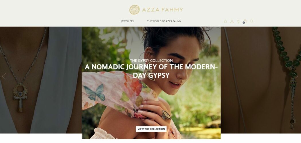
9. Using whitespace to focus attention
Brands that want to give off a more simplistic and “less is more” aesthetic can do so by making use of whitespace. This is a trend that has been slowly growing over a few years in web design and has recently become very popular, especially among eCommerce and luxury brands.
The web is moving away from cluttered sites that look too busy and are overflowing with information.
Modanisa uses whitespace in its catalogs to make the clothing the center of attention and to give the shopper an elegant, simple shopping experience without too many distractions.
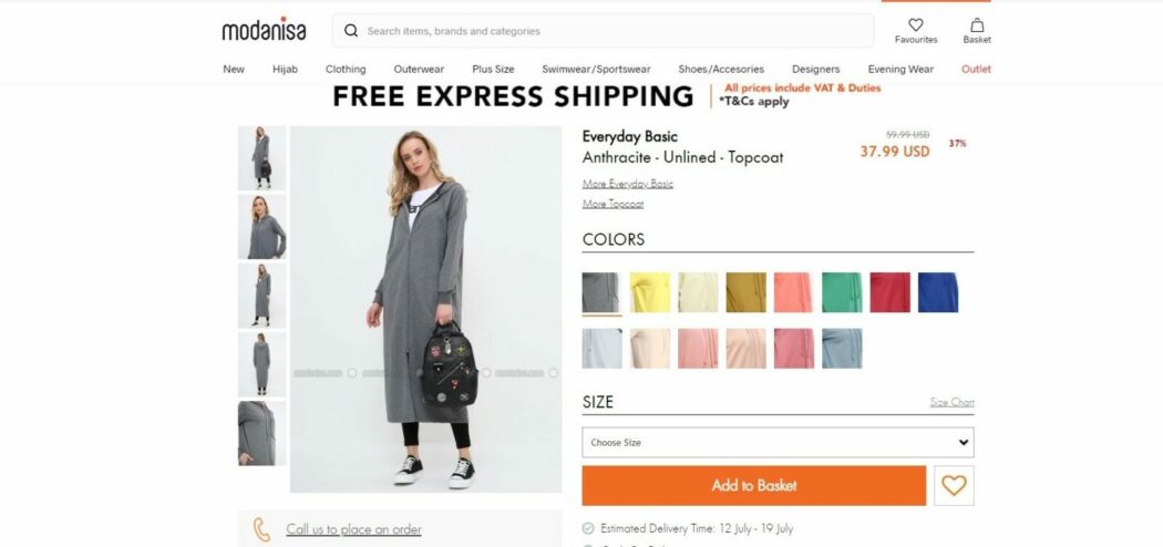
This web design trend works nicely with fashion brands and eCommerce stores that provide an online shopping experience and want to offer a luxury or premium product.
Before, such companies used to shove trust badges and credit card logos on their sites. This trend minimizes all of the extra noise. It uses whitespace to make the most of the online shopping experience.
10. Scroll animations
This web development trend is a tricky one, as it’s easy to use incorrectly.
We’ve all visited a website where you start scrolling and suddenly things are moving in choppy motions, your browser starts having a hard time going through the animation, and the entire time you’re just trying to figure out what’s going on. Most of the time, that’s the end result with scroll animations.
While the trend is growing, using too many scroll animations can be a less-than-delightful user experience. Scrolling animations should be purposeful, moderated and, quite honestly, used at a minimum.
Overdoing it in this department can cost you some serious user-experience points for the sake of being trendy. Use this one with caution!
A few sites to check out that use animations as you scroll are Apple and Wealthsimple.
When used correctly, these animations can give your website an innovative edge and make your products and services truly stand out.
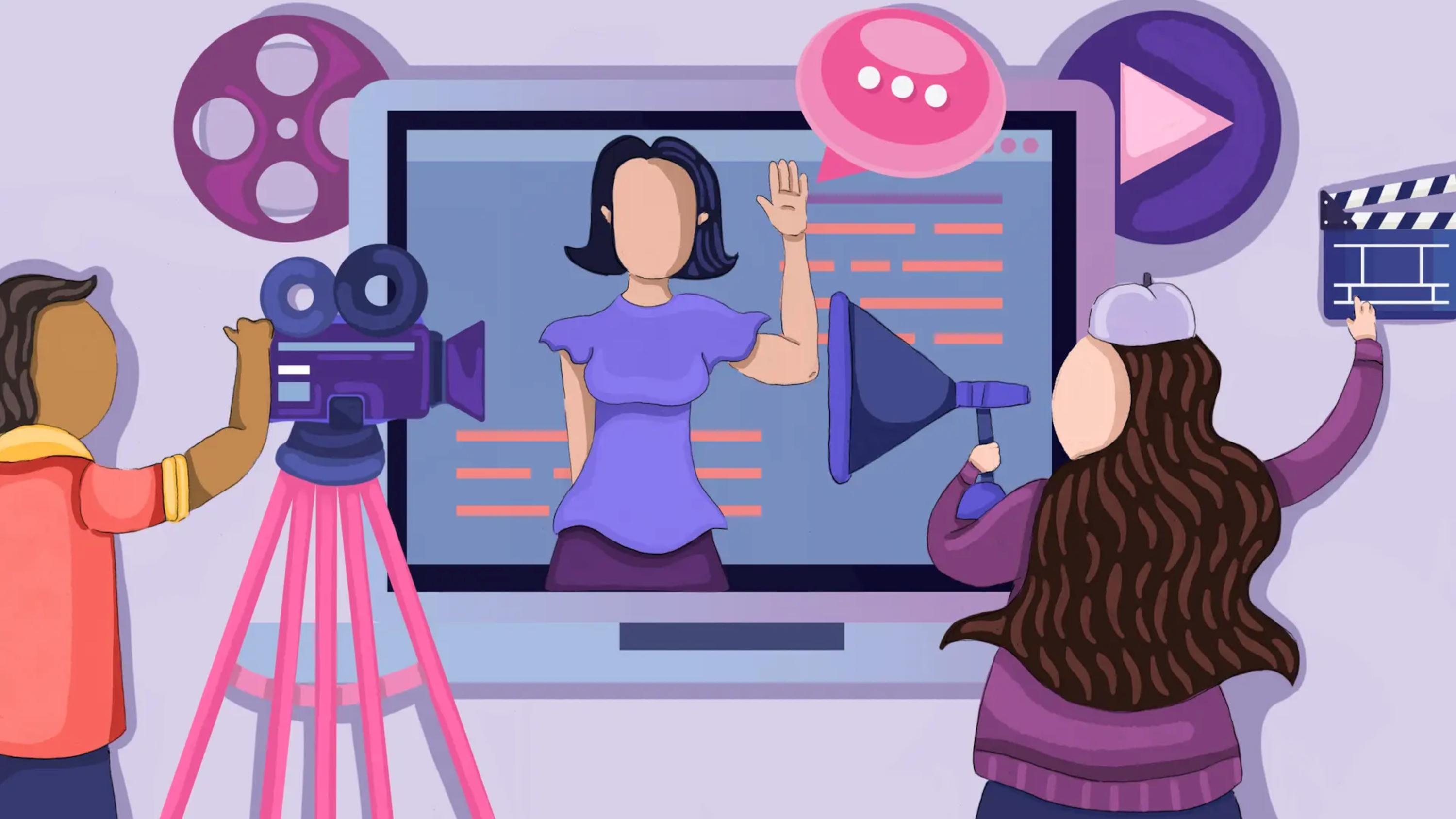
11. Full-screen video backgrounds
What better way to captivate an audience than with a full-screen video background?
This trend has been around for some time, and it’s making its way onto this list of 2019 web design trends because web designers still love using it!
In fact, according to Search Engine Watch, videos generated a 41% higher click-through rate than plain text alone.
It’s no wonder why brands like Teavana and Sonos are resorting to video to share their brand story and make a connection with their visitors.
If you decide to give this trend a try, I recommend making sure your video is muted in the background, as opposed to an auto-play video that instantly starts playing audio. This can have a negative effect and turn away your visitors.
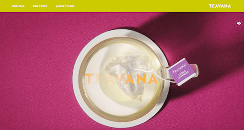
Video backgrounds are a great way to connect with your audience and increase the time visitors stay on your site. Videos also reduce the time it takes for visitors to figure out what you’re selling and help minimize the decision-making process. A video background clearly outlines what you’re selling as well as the lifestyle of your brand.
Related: Here’s why your small business needs to embrace video content now
Web design trends: Wrapping up
In the world of web design, it takes a combination of risk, creativity and innovation to build a fantastic website that will successfully communicate a brand’s story while generating great results for your clients.
Hopefully, we have saved you some time with these curated 2019 web design trends and that you’ve received some fresh inspiration to start off your next web design project.
A mixture of these trends can help you bring your projects into the next generation of web design.
When you’re juggling a handful of projects, having the proper set of web design tools in your arsenal can make a world of difference. Save time with free tools and resources for web designers and developers by joining GoDaddy Pro. GoDaddy Pro is a free service that helps web designers and developers save time on client and website management, and make some rewards along the way! Sign up for GoDaddy Pro for free!